Magazines: Front cover practical project
Magazine practical production
Research
1) Use Google to research potential magazines that you could use as your brand/design for this project. Create a shortlist of three potential magazines and upload an example front cover from each one. We recommend looking at lifestyle magazines or a similar genre as these are more achievable to re-create.


2) Choose one of the three magazine brands to use for your project e.g GQ, Vogue or The Gentlewoman. Then find three different front covers for your chosen magazine and embed them in your blogpost. Analyse the fonts, colours and typical design. What is the language or writing style? How are the cover lines written? What camera shot is generally used for the cover image? You need to become an expert in the design and construction of this magazine and its branding.
The cover uses classic serif font for the masthead, the title is bold, uppercase and widely spaced making it instantly recognisable. The cover lines are minimal, using smaller clean fonts so they don't distract from the image. For the colour scheme, the dominant one is red and black, the colour of the masthead stands out strongly against the dark background which gives a dramatic look. This magazine mostly focuses on impact over information due top the minimal text. The camera shot is a medium close-up and the gaze of Ariana Grande connotes connection.

This cover uses a black and white colour scheme which makes it look really artistic and more serious compared to the others. The masthead is still in a serif font like Vogue, which keeps the brand consistent and recognisable. There isn’t a lot of text, so it feels quite minimal and high-end. The language would probably be quite sophisticated and editorial, not too casual. The image looks like a mid shot with more than one model, which is different and makes it stand out. Overall it gives a more creative and timeless vibe.
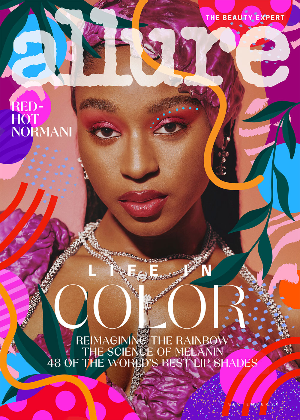
This cover is much lighter and softer, using pale colours and a clean background which makes it feel more fresh and commercial. The serif font is still used for the title so it keeps that luxury feel, but the “Best of” text makes it seem more friendly and aimed at a wider audience. There is likely a bit more text on this cover to promote what’s inside. The image is a close-up shot, focusing on the model’s face which is typical for beauty-focused covers. Overall it feels more approachable but still stylish.
1) In your blogpost, write your main cover line (also called the 'main flash') - this is the main cover story that links to your central image. It must be 100% original - all your own words.
2) Briefly plan the image you will need for the cover - model, costume, make-up, lighting etc. At this point, simply describe the image you need to capture.
3) Write the cover lines and any additional text you need for your magazine cover.
4) Sketch out your cover on plain A4 paper using your written planning. Take a photo of your sketch and upload it to your blogpost.
Photoshoot
1) Once you have completed your design you need to save or export a copy as a JPEG image. Then, upload it to your blogpost.


3) Write a short evaluation of your work: have you succeeded in your brief to create a new, original edition of an existing magazine? Does your cover stand up alongside the genuine covers of your chosen magazine? How professional is your work alongside those genuine examples?

Comments
Post a Comment